

I’ve announced this once, but not a lot of people have seen it - Color Counter on the HueForge store shows the problem. Your images have a lot more colors than you think. And not just a few. Hundreds of thousands of them.
This matters any time you want to recreate an image in a color limited medium. That could be paints, filaments, beads, thread, vinyl, paper to name a few - the list is long.
If you inspected the parrot image below, you would probably think of it as being red, green, yellow, blue, white, brown and black. Maybe you’d add pink and a darker blue and gray. But in your head this is conceptually a simple image.
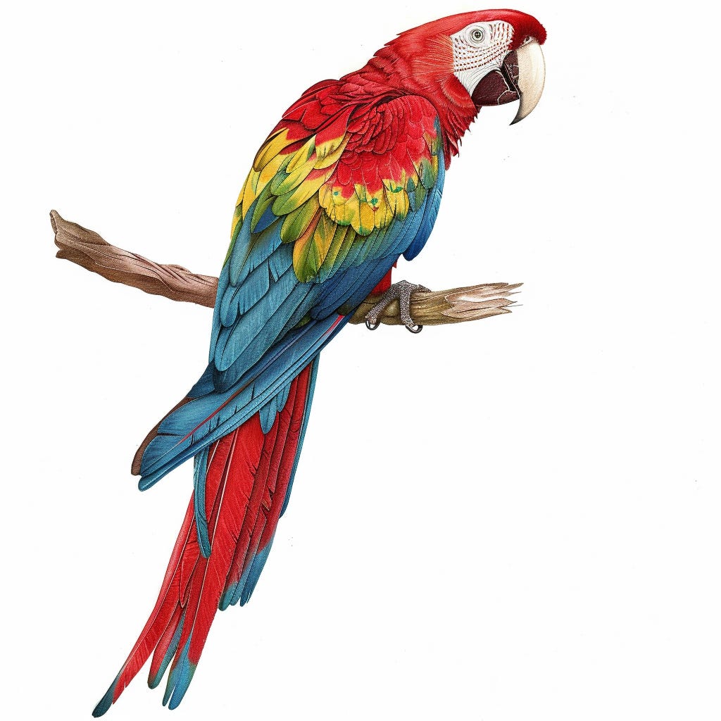
It actually has 190,418 colors.
What if it doesn’t need some of those colors? What if it doesn’t need most of those colors and it would look effectively the same to you?
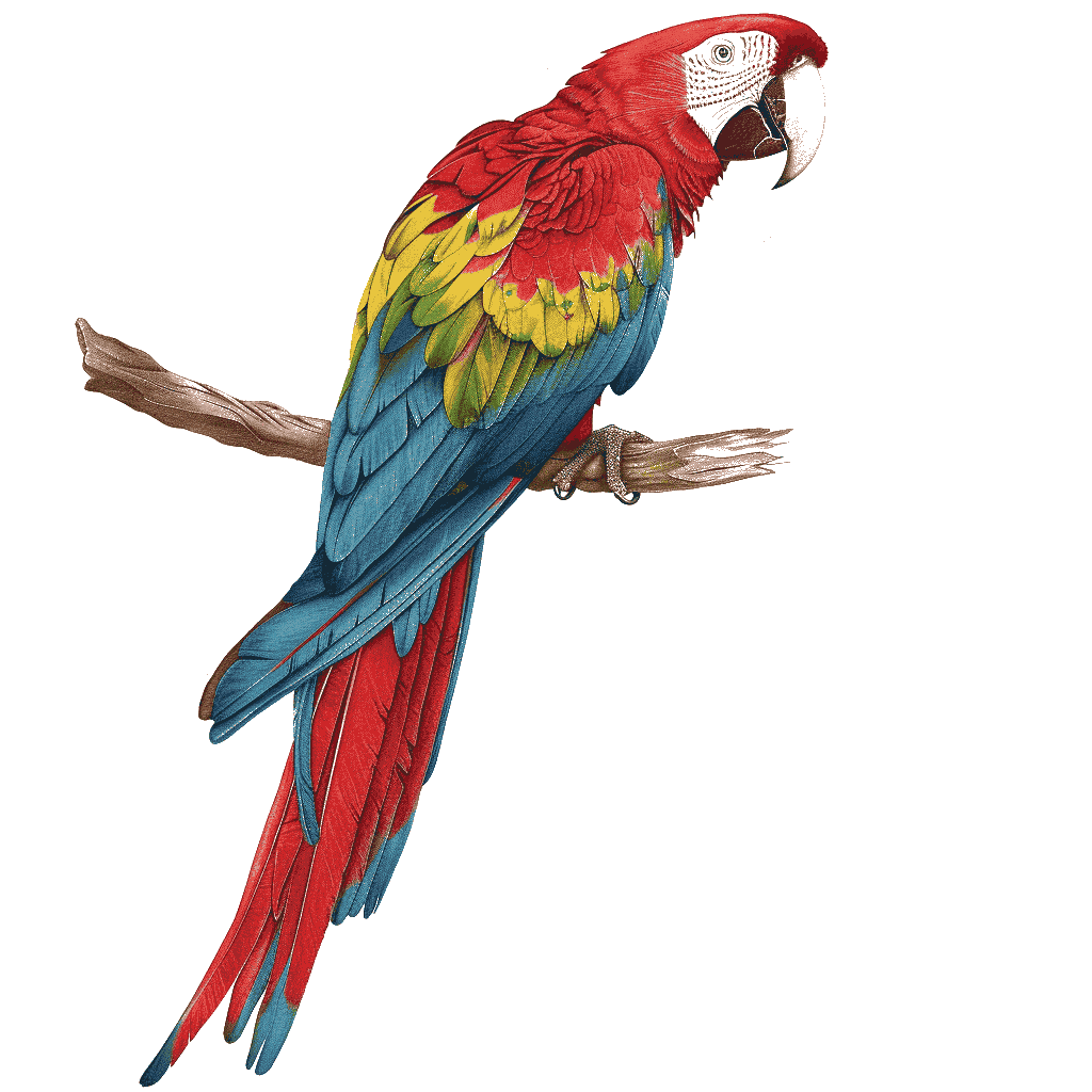
Want to guess the number now? Click →1
This isn’t even a “bad” image in terms of colors. Most images we see on the internet are 300k+ colors. Some even as high as 1.5 Million or more distinct shades.
ColorSmith is a tool I have been working on that gives you control over how many colors your image has. It isn’t that color is bad, quite the opposite, for the past 3+ years I’ve made my living helping people express more colors from their 3D Printers. The issue is using hundreds of thousands of colors when just a few would do. It makes handling and manipulating images so much harder.
Want to try it out? The ColorSmith site is a live demonstration you can put your own images in and see what comes out. No image data is collected - the code runs entirely on your device so your data stays there. Please read the privacy statement on the site if you have more questions.
ColorSmith Demo
The Philosophy of ColorSmith is this:
Be smart when you pick the colors to keep using
Let the user override/update/expand those choices when it makes sense
The algorithm here is called “quantizing”. Some people refer to it as “posterizing”. Basically, reducing the number of colors used to represent an image. Historically the algorithms used for this were all or nothing. They reduce colors with very little concern over whether a color is important to the image or not, and when they are done, you only have one real "knob” you can turn. How many colors total.
But images are complex and vary a lot. And while one hyper detailed image might quantize just fine.


Another might have issues that need to be resolved.


Notice the leaves got chunky and the lips lost their color. We added 38 new colors but the goal isn’t no colors - it’s colors where they are needed. The structure of the image was always intact and we can use the tools to recover what is missing quickly.
Does this have anything to do with HueForge?
HueForge is a limited color system - using Filaments and layers to blend a finite number of colors to represent an image. One thing you’ll notice when looking at quantized images, they look a lot like the HueForge Preview window.
Which makes you start to think. Can ColorSmith identify images that are good candidate for HueForge? Or at least can it point out images likely to be difficult in HueForge? I believe it can. But more importantly, Color Matching against under 100 colors is so much easier and more repeatable than color matching against hundreds of thousands.
This is the reason that ColorSmith’s first release will be as a free Plugin for HueForge. A bit of a new kind of plugin too. One that runs in the main HueForge window, not just in a separate dialog. It will automatically load your project image, quantize it, let you adjust that result and then replace your project image with the quantized image. I know quite a few people who vectorize their images to reduce color counts for HueForge. With the ColorSmith plugin, this becomes an unnecessary step.
If you haven’t yet, try the ColorSmith demo and notice you can drop an hfp file (HueForge Project) directly into it if it has the image information embedded (the default).
ColorSmith Demo
Tools like AutoForge also rely on a first quantize step but that step loses too much detail. ColorSmith output could provide a much more detailed starting image.
What EXACTLY Is ColorSmith
So what is ColorSmith itself going to be? It is two things. It’s a standalone application and it’s a HueForge plugin. Some of the changes in 0.9.4.2 are to make ColorSmith work better as a plugin. You won’t need to update HueForge for ColorSmith to work if you are running a 0.9.4.x version or later. Built from the ground up with lessons learned from HueForge, it ships with a tutorial system including per-function tutorials for the various correction functions. (Both the plugin and the desktop app)
The ColorSmith plugin will release as a free plugin. The ColorSmith standalone software will be paid software though I haven’t set a price yet (it will launch hopefully 4-6 weeks after the plugin, depending on feedback). But I plan to run the same, buy once pricing, that I do for HueForge. That is, unlimited usage and 2 years of updates. ColorSmith will ship with a single license tier for full commercial rights. It will also run fully offline.
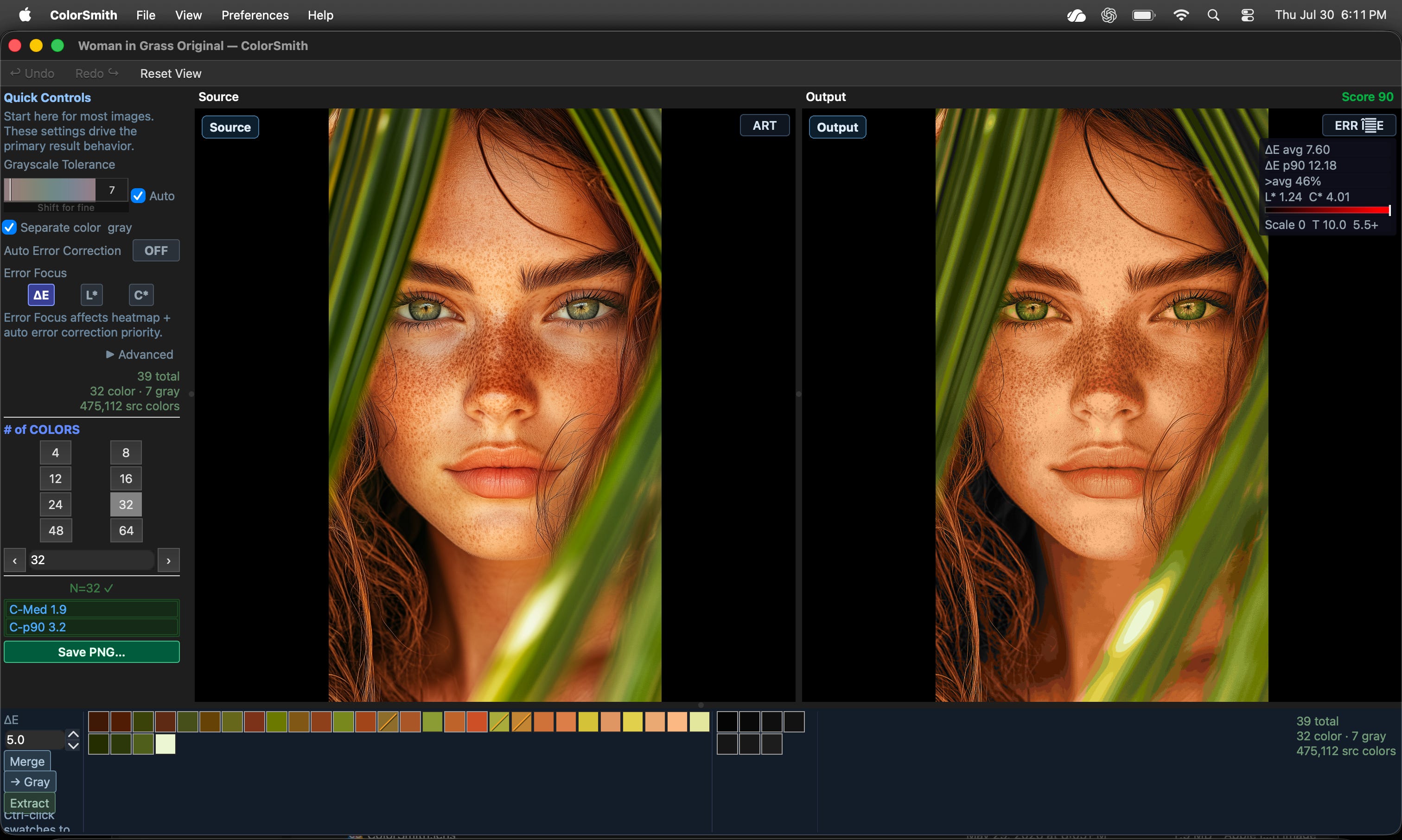
More on the Standalone version in the future, but in the meantime, here is a quick screenshot of the UI.
What Doesn’t Work?
ColorSmith is far from perfect and shallow gradients tell the story the best.


While the water, mountainside and shrine look fine, the sky is - well it’s bad.
And that’s because the sky really DOES need a lot of colors. Images with soft, shallow gradients are currently very hard. I can improve the sky with tools, but it can quickly become tedious. To the point where simply merging the sky into a one color is much easier and works better - taking just a minute or so to do.

The worst part is that ColorSmith currently thinks this image "scores” very poorly (63) and the previous image scores very well (90). In what seems to be a habit of mine, the ColorSmith Logo itself does not render cleanly.


This might be familiar to those coming from HueForge. It wasn’t until Color Match was launched that HueForge could even remotely create it’s own logo. Honestly the colors here mostly aren’t the problem, it’s the jagged color transition, and I already think I know the shape of the solution. Again, the scoring doesn’t realize how much this version differs to a human eye and I’m working on figuring out how to calculate that.
So the real struggle is very shallow gradients, especially if it’s also combined with a lot of different hues. Some of this can definitely be overcome.
In the meantime let me know if there are uses or features you would really like in the comments section.
The Parrot is 31 Colors
Downloaded plugin, but is grayed out in plugin dropdown box. Have multi-color image loaded and uninstalled, reinstalled ColorSmith but no joy.
Ken